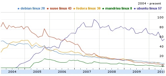
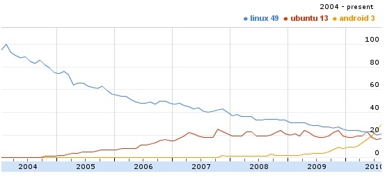
Several distributions of Linux where entered into Google’s search insights tool to calculate their popularity trends through the years starting from 2004.
And here are the results plotted in a graph:
- The first graph compares the most popular of Linux distro’s; Debian, SUSE, Fedora, Mandriva and Ubuntu. Though the result is fairly predictable.
 Here you can clearly see the rapid increase in Ubuntu’s popularity through the years 2004-2007, and after that it started to decrease slowly, i wonder what the reason.
- On a second interesting comparison; Linux, Android and Ubuntu were entered into Google’s search insights tool and here’s the resulting graph:
 Android’s popularity started to increase quickly in the year 2009.
looking at the charts, you can’t help but admire debian. it’s as steady as a rock when compared with other distros (excluding ubuntu).